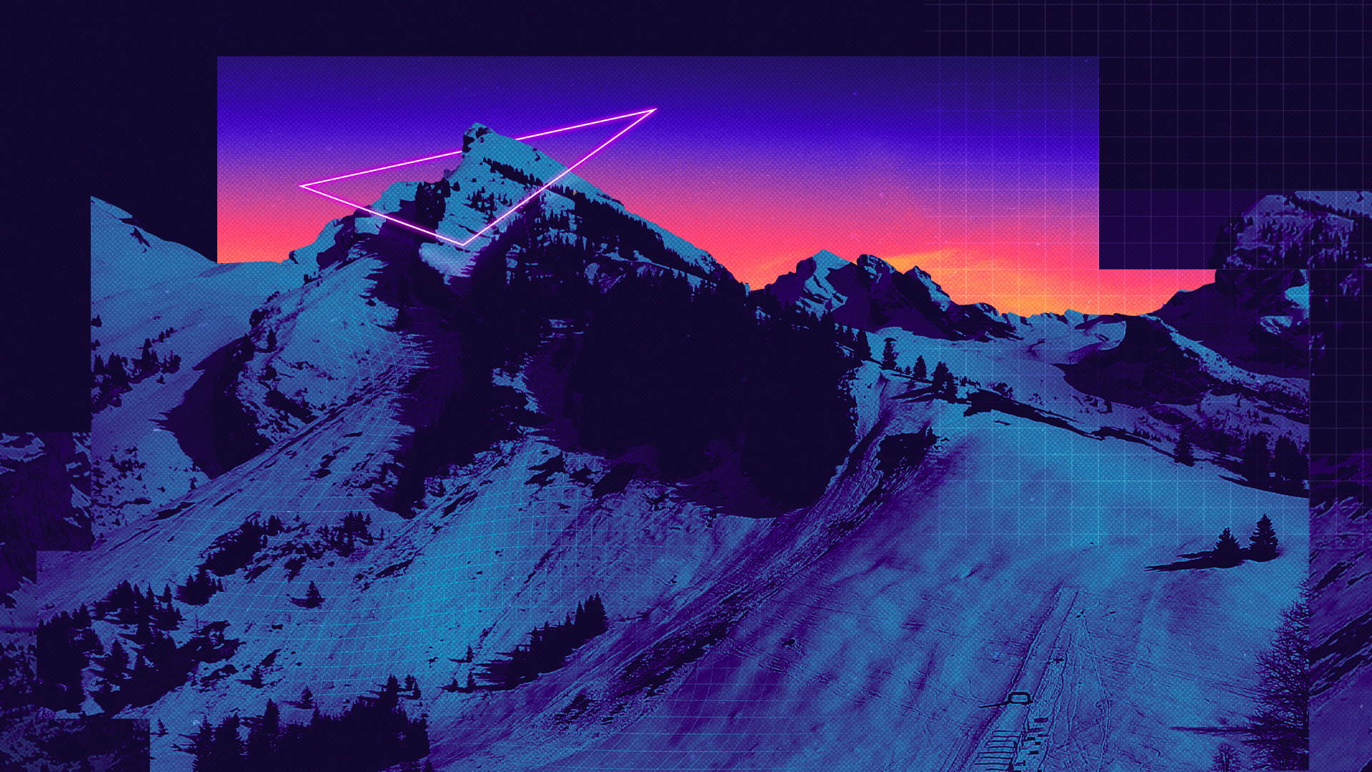
The strategic foundation guided the development of a complete brand world, from creative direction to visual identity. The logo one-line construction symbolises connection and togetherness and is a visual interpretation of organic movement in the mountains: a continuous single line that echoes winding alpine paths, fluid motion, and collective flow.
Wildpack
An Adventurous New Brand
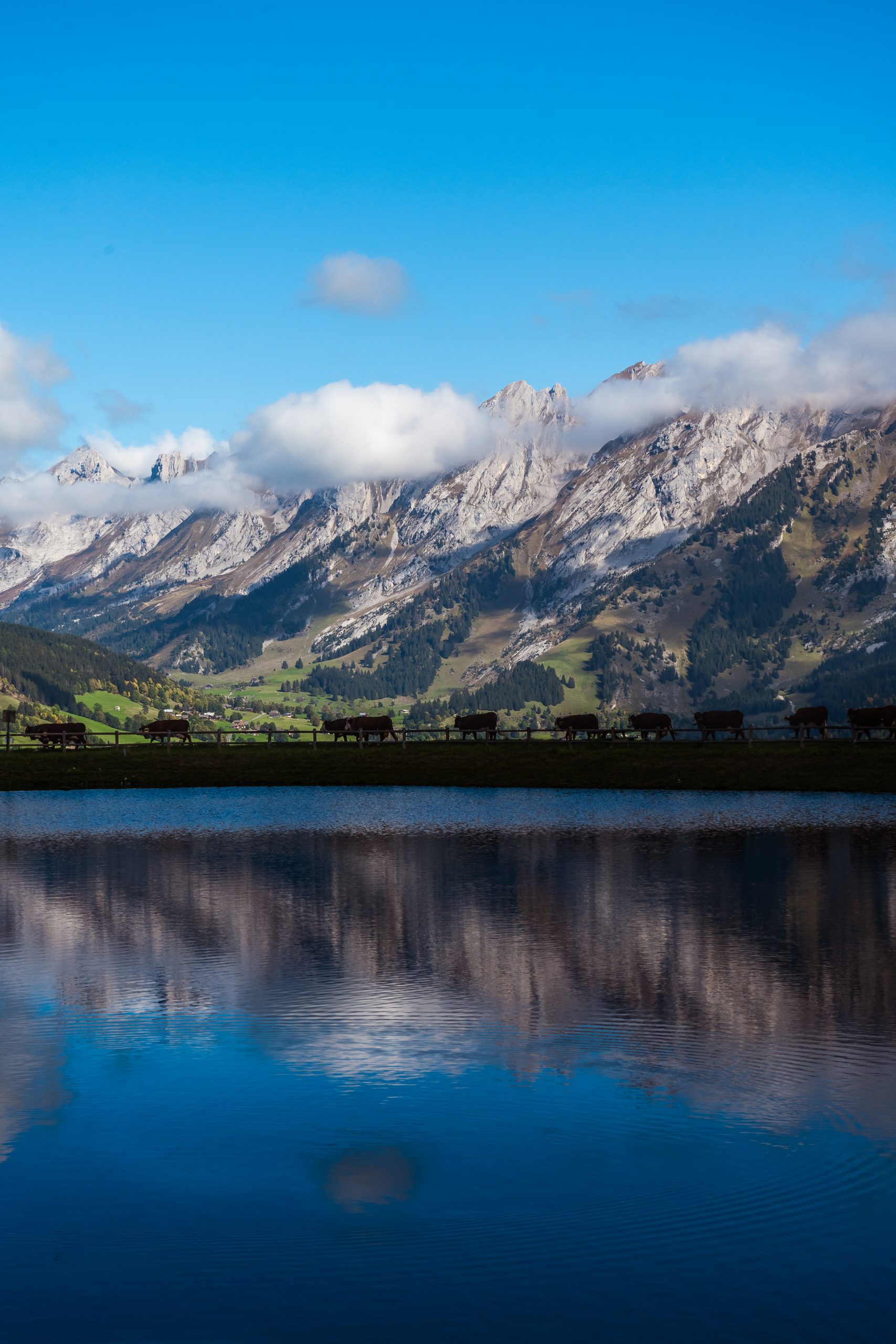
Wildpack was born from a simple idea: the outdoor is better when it’s shared. We partnered with this emerging outdoor collective to shape its vision, define the strategy, and build a new lifestyle brand that invites everyone to explore the wild together.
Our work focused first on brand strategy and positioning, clarifying Wildpack’s purpose as an inclusive, community-driven alternative to performance-led outdoor brands. We created a brand that champions accessibility, togetherness, and the joy of moving through nature at your own pace whilst making friends that last a lifetime.
The result is a bold and welcoming brand that opens up the outdoors to all, encouraging shared adventure, authentic connection, and a renewed relationship with nature.
DELIVERABLES


The wider identity embraces a bright, colourful palette balanced with organic forms and a non-pretentious design language. We wanted it to be playful and expressive, yet grounded and approachable. Built to be flexible and alive, we developed and executed content across digital, print, event, and social platforms, ensuring a coherent and engaging presence at every touchpoint.

#4CBBC2
Hiking
#F6564E
MTB
#FFB117
Family
#FA69D2
Trail Run